返回博客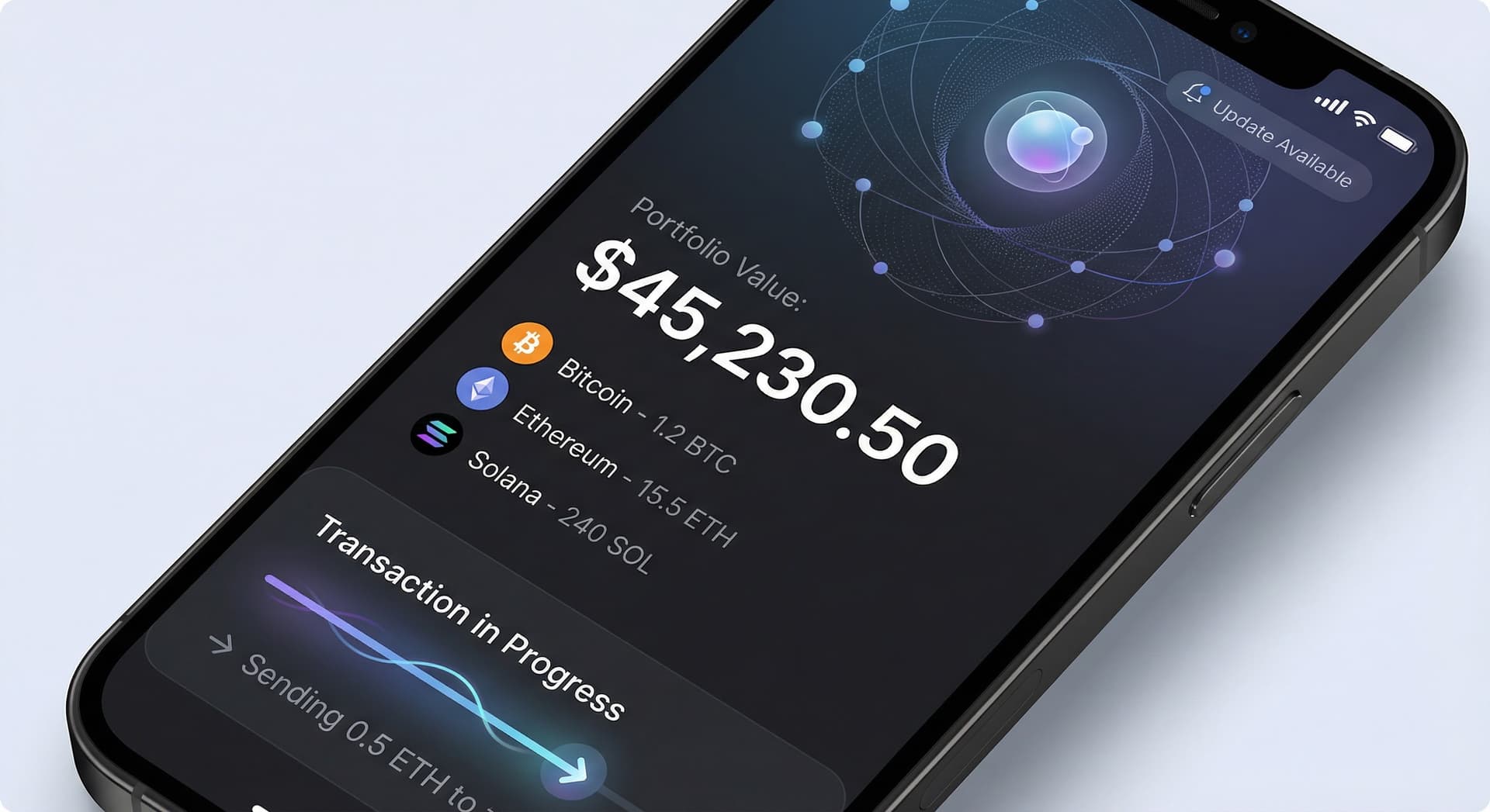
updateuxdesignextensioncompact-designsend-transactioni18n
Zelf Extension v2.0.57: UX Overhaul, Compact Design, and a Smoother Send Flow
The latest Zelf Extension update touches 78 files: compact design tokens, redesigned send and receive flows, improved account management, 13-language support, and better dark mode. Here is what changed.
Miguel Treviño•
TL;DR:
- 78 files changed across the Zelf Extension: a broad UX and design refresh, not a single feature.
- Compact design system: New CSS custom properties
--zns-font-scaleand--zns-space-scalelet the UI scale. 60+ components use responsive sizing; fullscreen mode is compact, popup stays comfortable. Everything fits on standard laptop screens without endless scrolling. - Home and account management: Wallet actions moved from an oversized 3x2 grid to a compact 3-column grouped layout. Actions are split into ZelfProof (Download, Mnemonics, Zelf Link) and Apps (Wallet, Zelf Keys, Auth). Truncated labels get instant CSS tooltips on hover. Manage Tags button resized to ~80% for better proportions.
- Send flow: Address Found preview is now a compact row (avatar, name, truncated address). Recent addresses no longer duplicate the Address Found card. Click to deselect a recent address; click again to clear. Smoother path from address selection to confirmation.
- Receive flow: New Learn More risks modal with carousel cards for token safety (e.g. "Do not send ETH to a Solana address"). Slide animations between receive screens.
- Security and onboarding: Dark mode fix so security options use correct theme colors. Password vs PIN detection shows the right unlock prompt. Face-not-centered error shows a friendly message. Enter key triggers PIN verification on the last digit.
- 13 languages: New and updated strings for en, es, fr, ja, ko, zh, ar, pt-BR, hi, ur, th, ru, ph—compact labels, risk modal, PIN copy, errors.
Compact Design System
We introduced design tokens so the extension can adapt to different contexts without duplicating layout logic:
--zns-font-scaleand--zns-space-scalecontrol typography and spacing. In fullscreen mode, we use compact values so the full UI fits on a typical laptop without scrolling. In popup mode, we keep comfortable sizing for quick actions.- 60+ components were migrated to use these tokens. Buttons, cards, inputs, and lists now scale consistently. The result: one codebase, two tuned experiences (popup vs fullscreen).
If you use Zelf in fullscreen for portfolio and send flows, you should notice more content above the fold and less clutter.
Home: Account and Wallet Actions
The home screen is where you choose between Wallet, Zelf Keys, Auth, and ZelfProof actions. Previously, actions lived in a large 3x2 grid that consumed a lot of space.
New layout:
- 3-column grouped layout instead of 3x2. Actions are grouped by purpose.
- ZelfProof group: Download, Mnemonics, Zelf Link—everything tied to your identity and backup.
- Apps group: Wallet, Zelf Keys, Auth—your daily tools.
- Labels that are too long are truncated, with instant CSS tooltips on hover so you still see the full text.
- Manage Tags button was reduced to about 80% size for better visual balance with the rest of the actions.
You get the same actions in less space and with clearer grouping.
Send Transaction: Address Selection and Confirmation
Sending tokens is one of the most used flows. We tightened it end-to-end:
- Address Found preview: When you type a name or paste an address and we resolve it, the preview is now a compact row: avatar, name, and truncated address. No more oversized card eating the screen.
- Recent addresses are listed separately and no longer duplicate the Address Found card. So you do not see the same recipient twice.
- Deselect behavior: Click a recent address to select it. Click again to deselect. One more click clears the selection so you can type a new recipient. Clearer mental model.
- Flow: From address selection through amount and confirmation, transitions and layout are smoother so you can complete sends faster.
Receive: Risks and Education
Receiving tokens safely means avoiding wrong-network sends and scam tokens. We added:
- Learn More entry point that opens a risks modal with a carousel of short tips—e.g. "Do not send ETH to a Solana address," and other chain-specific warnings.
- Slide animations between the main receive screen and the modal (and between carousel cards). The flow feels more polished and encourages a quick read of the tips.
Security and Onboarding Polish
- Dark mode: Security and unlock options now respect the active theme. No more mismatched colors in dark mode.
- Password vs PIN: The extension detects whether your wallet is unlocked with a password or a PIN. The unlock screen shows the correct prompt (e.g. "Enter PIN" vs "Enter password") so there is no confusion.
- Face verification: If your face is not centered in the frame, the error message is user-friendly instead of technical.
- PIN entry: On the last digit of your PIN, pressing Enter submits the PIN immediately—no need to tap a separate button.
Small touches, but they reduce friction and support correct use.
13-Language Support
We expanded and updated i18n so the new UI is fully localized:
- Languages: English, Spanish, French, Japanese, Korean, Chinese, Arabic, Portuguese (Brazil), Hindi, Urdu, Thai, Russian, Filipino.
- New/updated keys cover: compact labels, risk modal text, PIN unlock copy, face-error messages, and other strings introduced in this release.
If you use Zelf in a non-English locale, you should see consistent translations across the new compact layout, send flow, and receive flow.
Summary
v2.0.57 is a UX overhaul: compact design tokens, reorganized home screen, a cleaner send flow with smarter address handling, a safer receive flow with a risks carousel, and security/onboarding fixes in both light and dark mode. Plus 13 languages supported out of the box.
Update to the latest version from Zelf and try the new layout in both popup and fullscreen—everything should feel tighter, clearer, and easier to use.